

Table of Contents
- Understanding DTF Artwork Requirements
- Setting the Right DTF File Resolution Settings
- Removing Background for DTF Printing
- Choosing the Right File Format and Color Mode
- Handling Fine Details and Color Accuracy
- Testing and Proofing Before Production
- Common Mistakes to Avoid When Preparing DTF Artwork
- Preparing Artwork for DTF: Final Checklist
- Frequently Asked Questions
Last Updated: September 30, 2026
Understanding DTF Artwork Requirements
Direct-to-film (DTF) printing demands artwork that's fundamentally different from what works for screen printing or other transfer methods. The process transfers ink directly onto a special film, then applies it to fabric using heat and pressure. This means your artwork file needs to account for how DTF handles color, detail, and transparency in ways traditional methods don't.
The most common issue we see isn't bad artwork, it's artwork that wasn't prepared with DTF's specific technical requirements in mind. A logo that looks perfect on screen can print with muddy colors or lost details if the file isn't optimized for this process.
The good news: learning how to prepare artwork for DTF printing follows clear, learnable rules. Once you understand these fundamentals, you'll avoid the costly mistakes that force reprints and waste time.
Setting the Right DTF File Resolution Settings
Why 300 DPI Matters for DTF Transfers
Resolution is the first critical decision when preparing artwork for DTF printing. The standard for all professional transfer methods is 300 DPI (dots per inch). This isn't arbitrary, it's the threshold where human eyes stop seeing individual dots and perceive a smooth, continuous image.
At 300 DPI, each pixel becomes small enough that fine lines stay sharp and color gradients blend smoothly. Drop below this and you'll see pixelation. Go above it and you waste file size without gaining visible quality.
DTF transfers need 300 DPI specifically because the film layer amplifies any resolution problems. A slightly soft image in screen printing might pass unnoticed. That same image on DTF film shows every flaw when it transfers to fabric.
Scaling Artwork Without Quality Loss
The way you scale artwork determines whether you maintain quality or destroy it. This is where vector versus raster files matter most.
If your artwork starts as a vector file (Adobe Illustrator, EPS, PDF), you can scale it to any size without loss. Vectors use mathematical equations to describe shapes, so they stay sharp at any dimension. Scale a vector logo from 2 inches to 12 inches, no quality loss.
Raster files (JPEG, PNG, standard Photoshop files) work differently. They're made of pixels arranged in a grid. Scale a raster image up and you're asking the software to guess what pixels should fill the new space. The result is blurry or pixelated artwork.
The rule: start with vector files whenever possible. If you only have raster artwork, never scale it larger than the original. Scaling down is safe. Scaling up creates problems.
Removing Background for DTF Printing
DTF transfers work best when backgrounds are completely removed. Unlike some printing methods, DTF doesn't handle partial transparency well, the process needs clean, defined edges.
Start by isolating your artwork in design software. Use the magic wand tool or color range selection to grab everything that isn't your image. Delete it. What remains is your artwork on a transparent background.
This transparent layer is critical. In your file, transparency appears as a checkerboard pattern in most design software. That checkerboard tells the DTF RIP software: "Don't print anything here." Without it, you'll get a solid background color that looks wrong on fabric.
If you're working in Photoshop, make sure your layer has an alpha channel (the transparency layer). Go to Layer menu → Transparency → Add Layer Mask if it's not already there. Save as PNG to preserve that transparency.
For complex artwork with soft edges or gradients that fade to nothing, be extra careful. Semi-transparent pixels (pixels that are partially see-through) can cause banding, visible stripes or rings where the transparency shifts. We'll cover how to fix this in the next section.
Choosing the Right File Format and Color Mode
PNG vs. Vector: Which Format Works Best
PNG files and vector files each serve different purposes in DTF artwork prep. Understanding when to use each prevents quality problems downstream.
PNG files are raster images that support transparency (Portable Network Graphics (PNG) Specification (Second Edition)). They work well for photographic artwork, complex illustrations, or designs with many colors and gradients. A PNG preserves exactly what you see on screen. The downside: PNG files can't scale up without quality loss.
Vector files (AI, EPS, PDF) are made of mathematical paths and shapes. They scale infinitely without degradation. Vector files are ideal for logos, text, and geometric designs. They produce the sharpest possible transfers.
For most DTF work, start with vector if you have it. If your artwork is photographic or too complex for vector, PNG is your next choice. Never use JPEG for DTF, JPEG compression destroys the clean edges you need.
Save your final file as PNG or PDF (PDF preserves vector data). When you submit to a DTF provider like Mirage DTF Transfers, they'll convert it to the format their RIP software needs. Your job is to deliver the cleanest source file possible.
RGB vs. CMYK: Color Mode Selection
Color mode determines how your design software represents color. This choice affects how your artwork looks when it prints.
RGB (Red, Green, Blue) is screen color. It's what you see on your monitor. RGB uses light to create colors by mixing red, green, and blue light at different intensities. This is the right mode for DTF artwork because DTF ink behaves more like screen color than print color.
CMYK (Cyan, Magenta, Yellow, Black) is traditional print color. It's used for offset printing and some other methods. CMYK mixes pigments on paper to create color. If you prepare artwork in CMYK for DTF, the colors often look dull or shifted when they transfer to fabric.
Keep your artwork in RGB throughout the entire design process. Only convert to CMYK if a specific DTF provider requests it (most don't). When you export your final file, choose RGB as the color mode.
Handling Fine Details and Color Accuracy
Avoiding Pixelation and Semi-Transparent Pixels
Fine details, thin lines, small text, intricate patterns, are where DTF artwork prep gets technical. The process can lose detail if your file isn't structured correctly.
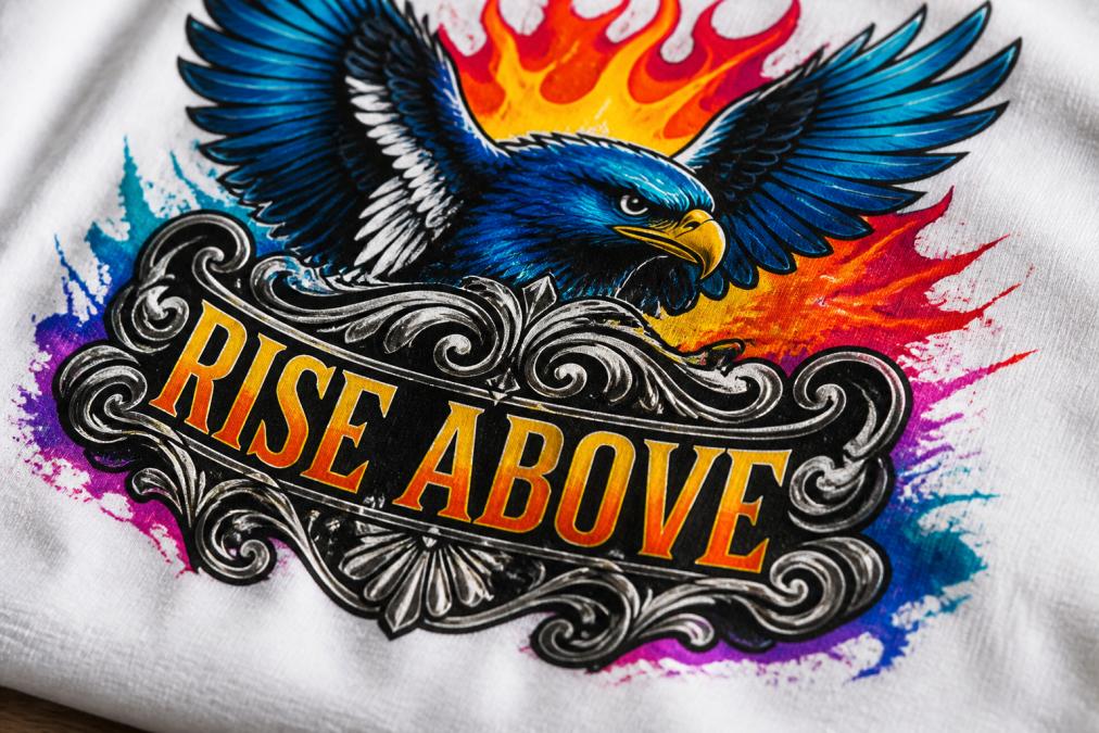
Pixelation happens when your resolution is too low or when you've scaled raster artwork too large.
Managing ICC Profiles and Color Gamut
ICC profiles are color management files that tell your software how to interpret and display color. They're invisible to most users but critical for consistent color between your screen and the final transfer.
Testing and Proofing Before Production
Never send artwork to production without testing it first. A test print costs far less than reprinting an entire order.
- Pixelation or blurry edges
- Color accuracy compared to your original file
- Fine details coming through clearly
- No visible banding or semi-transparent artifacts
- Even ink coverage with no thin or thick spots
Common Mistakes to Avoid When Preparing DTF Artwork
Scaling raster artwork too large. This is the most common mistake. A logo that's 2 inches wide at 300 DPI becomes pixelated if you enlarge it to 8 inches. Always start with vector files or keep raster artwork at its native size.
Preparing Artwork for DTF: Final Checklist
Use this checklist before submitting any artwork for DTF printing:
| Step | Status | Notes |
|---|---|---|
| File format is PNG or vector (AI, EPS, PDF) | ☐ | Never JPEG |
| Resolution is 300 DPI | ☐ | Check in Image → Image Size |
| Color mode is RGB | ☐ | Not CMYK |
| Background is transparent | ☐ | Checkerboard pattern visible |
| No semi-transparent pixels | ☐ | Flatten if needed |
| Artwork is at final size | ☐ | Don't scale up after export |
| Fine details are crisp | ☐ | Zoom to 100% and verify |
| Colors match your design intent | ☐ | Account for slight saturation shift |
| Test print approved | ☐ | Compare to original file |
| File is named clearly | ☐ | Use descriptive names |
Frequently Asked Questions
What is the minimum DPI required for high-quality DTF transfers?
DTF printing requires 300 DPI for crisp, professional-quality transfers. This resolution ensures fine details, text, and gradients reproduce clearly without pixelation. If your artwork is below 300 DPI, scaling it up will degrade quality. Always start with source files at 300 DPI or higher, and maintain this resolution through export to ensure your DTF transfers meet professional standards.
Should I use CMYK or RGB color mode when preparing artwork for DTF printing?
Use RGB color mode for DTF printing. DTF transfers display colors using light-based RGB, which delivers more vibrant and accurate color reproduction than CMYK (which is designed for offset printing). RGB files also provide a wider color gamut, allowing your artwork to maintain saturation and contrast throughout the DTF process. Convert to RGB before exporting your final file.
How do I remove the background from my artwork for DTF printing?
Use design software like Adobe Photoshop, Illustrator, or free alternatives to remove backgrounds and create transparency. For PNG files, ensure the background layer is deleted, leaving a transparent alpha channel. For vector formats, delete the background shape entirely. Save with transparency enabled. Transparent backgrounds allow DTF transfers to adhere cleanly to fabric without white or colored edges, resulting in professional-looking prints.
What file format should I use for DTF artwork, PNG or vector?
PNG works well for photographic or complex artwork with many colors, while vector formats (AI, EPS, PDF) are ideal for logos, text, and designs with solid colors and fine lines. Vector files scale without quality loss and prevent pixelation on large prints. PNG files are raster-based and can pixelate if enlarged. Choose based on your artwork type: use vector for graphics and logos, PNG for photos and detailed illustrations.