

Table of Contents
- Understanding Color Shifts in DTF Printing
- DTF Color Profiles and ICC Settings
- DTF File Preparation for Accurate Colors
- DTF Heat Press Temperature and Time
- DTF Color Correction and Quality Control
- Environmental and Production Variables
- A Diagnostic Workflow to Isolate Color Shift Sources
- Frequently Asked Questions
Last Updated: October 12, 2026
Understanding Color Shifts in DTF Printing
Color shifts happen when your printed transfer doesn't match your digital file. The garment arrives and the blues look purple. The reds appear washed out. These aren't accidents, they're the result of specific breakdowns in your workflow.
Understanding which one is failing is the first step to fixing it.
Common causes of color inconsistency
Screen-to-print mismatch happens because monitors and printers speak different color languages. Your screen displays RGB (red, green, blue light).
The second major cause is incorrect ICC profiles. An ICC profile tells your RIP software how to convert your digital colors into printer commands.
Ink quality issues also shift colors. Old ink, contaminated ink, or ink that doesn't match your printer's specifications will change how colors appear on the transfer.
Heat press problems cause color shifts during application. Too much heat damages the adhesive layer and causes dye migration, where colors bleed into surrounding areas.
Why color looks different on screen versus print
Your monitor shows light-based color. Your printer produces pigment-based color. A bright blue on your screen might need different ink amounts to match on film.
This is why color management exists, to bridge that gap. Without it, you're guessing. The fix requires three steps:
- Use a calibrated monitor (or accept that your screen won't match print)
- Apply the correct ICC profile for your specific printer model
- Test with a reference print before running full orders
DTF Color Profiles and ICC Settings
Preventing color shifts in DTF printing starts with proper color profiles. Your RIP software uses these profiles to translate your design into printer commands. The wrong profile means wrong colors, every time.
Setting up your RIP software correctly
Your RIP (Raster Image Processor) is the software between your design file and your printer. It reads your file and tells the printer exactly how much ink to drop on the film.
Start by selecting your printer model in the RIP settings. This loads the correct ink set and nozzle configuration.
Most RIP software lets you soft-proof your design before printing. This shows you how the colors will look with your current settings. Use this feature. If the preview looks wrong, adjust before wasting film.
Common RIP mistakes:
- Using a generic DTF profile instead of your specific printer model
- Leaving color management set to "printer manages colors" when it should be "RIP manages colors"
- Not updating profiles after printer firmware updates
- Applying sharpening or saturation boosts that distort color accuracy
Calibrating your printer to match industry standards
Printer calibration ensures consistent output day to day. A calibrated printer produces the same colors whether you print on Monday or Friday.
Calibration requires:
- A nozzle check (to ensure all nozzles are firing evenly)
- A cleaning cycle (to remove dried ink from the printhead)
- A test print of a standard color chart
- Measurement of that test print against a reference
Many printers include built-in calibration routines. Run these monthly, or more often if you notice color drift. Some production teams use a spectrophotometer, a device that measures printed color precisely, to verify calibration accuracy.
If your printer lacks built-in calibration, contact your printer manufacturer for guidance.
DTF File Preparation for Accurate Colors
Your design file is the starting point. Errors here cascade through the entire workflow.
Converting RGB to CMYK without losing vibrancy
RGB-to-CMYK conversion is where most color loss happens. RGB uses light and can display colors CMYK ink cannot reproduce. When you convert, some colors shift to the nearest CMYK equivalent.
The solution is soft proofing before conversion. In your design software, apply the CMYK profile you'll use for printing. This shows you what colors will actually print.
Best practices for RGB-to-CMYK conversion:
- Use perceptual rendering intent (preserves color relationships)
- Convert in your design software, not your RIP
- Test the converted file with a proof print before full production
- Keep saturation slightly lower in RGB to leave room for CMYK reduction
Avoid over-saturating colors in your original file. Vibrant colors in RGB often can't be matched in CMYK, so dial them back slightly to ensure they print as intended.
White ink underbase and coverage optimization
White ink is the foundation of DTF transfers on dark garments. It sits under your color inks and provides coverage. Without proper white ink setup, colors look faded or translucent.
White ink coverage depends on:
- Nozzle count dedicated to white (more nozzles = thicker white layer)
- White ink viscosity and age
- Film tension and print speed
- Heat press curing time
Most DTF printers let you adjust white ink density in the RIP. Start at 100% coverage for dark garments, then test. If the white layer feels too thick or sticky, reduce to 80-90%. If colors appear translucent, increase to 110-120%.
Test white coverage on actual garments before committing to large orders. The feel and durability of the transfer depend on getting this right.
DTF Heat Press Temperature and Time
Heat press application is where most color shifts actually occur. Wrong temperature, time, or pressure damages the transfer and shifts colors permanently.
Testing for dye migration and overheating
Dye migration happens when heat causes colors to bleed into the white ink or surrounding areas. This creates halos around designs and muddy color mixing. It's one of the most common complaints about DTF transfers.
Test for dye migration:
- Print a design with solid color blocks on white film
- Apply to a dark polyester garment at your normal heat settings
- Let cool completely (at least 2 minutes)
- Examine edges under bright light for color bleeding
- Wash the garment once and check again
If you see color bleeding, your heat is too high or press time is too long. Reduce temperature by 5-10 degrees and test again.
Overheating also causes:
- Adhesive powder to melt and become sticky
- White ink to yellow or discolor
- Color inks to fade or shift toward darker tones
- Fabric to scorch or melt
Pressure and curing settings by fabric type
Different fabrics need different heat settings. Polyester is most common for DTF, but cotton blends and specialty fabrics require adjustment.
Polyester: 320-340°F for 10-15 seconds with medium pressure. This cures the adhesive without damaging the film.
Cotton blends: 300-320°F for 12-18 seconds. Cotton needs longer curing but lower heat to prevent scorching.
Nylon: 310-330°F for 8-12 seconds. Nylon is heat-sensitive and can melt if pressed too long.
Always test on actual garment samples before running production. Fabric weight, weave, and finish all affect how heat transfers through the material.
DTF Color Correction and Quality Control
After printing, inspect every transfer before application. Catching problems here saves labor and customer complaints.
Nozzle checks and ink droplet consistency
A nozzle check shows whether all printer nozzles are firing evenly. If nozzles are clogged, colors shift and banding appears.
Run a nozzle check:
- Print the printer's built-in nozzle check pattern
- Look for missing lines or gaps in the pattern
- If gaps appear, run a cleaning cycle
- Retest after cleaning
Nozzle checks should be part of your daily startup routine. A few minutes of prevention saves hours of reprinting.
Ink droplet consistency affects color saturation. If some nozzles fire larger or smaller droplets than others, colors look uneven. This is usually a sign of:
- Clogged nozzles
- Incorrect ink viscosity
- Power supply voltage fluctuations
- Printhead age or wear
Diagnosing banding, fading, and gradient edge issues
Banding (visible horizontal lines in gradients) usually means nozzles are firing inconsistently. Clean the printhead and retest.
Fading (colors that look washed out) points to:
- Insufficient white underbase
- Old or low-quality ink
- Incorrect ICC profile
- Under-cured transfer
Gradient edge issues (blurry or stepped color transitions) happen when:
- Print resolution is too low (use 1440 DPI or higher)
- Ink droplet size is inconsistent
- RIP dithering settings are wrong
Test gradients regularly. A smooth gradient is a sign your color management is working.
Environmental and Production Variables
Your production environment affects color consistency as much as your equipment does.
Humidity, temperature, and power supply stability
Humidity changes ink viscosity. High humidity (above 60%) thickens ink and reduces color saturation. Low humidity (below 30%) thins ink and can cause nozzle clogs.
Keep your production space between 40-60% relative humidity. Use a dehumidifier or humidifier as needed.
Temperature swings affect both ink and adhesive powder. A 10-degree shift can change how the adhesive cures and how colors appear. Maintain a consistent room temperature, ideally 68-72°F.
Power supply stability matters more than most people realize. Voltage fluctuations cause the printhead to fire inconsistently, which shifts colors.
Ink quality and compatibility with your printer
Not all DTF ink is the same. Cheap ink might save money short-term but causes color shifts and clogging.
Check ink compatibility:
- Verify the ink is rated for your specific printer model
- Check the manufacturing date (old ink degrades)
- Inspect the bottle for sediment or discoloration
- Test a small batch before bulk ordering
If you switch ink suppliers, test thoroughly before committing. Different ink formulations have different viscosity and color characteristics, and your ICC profile might need adjustment.
A Diagnostic Workflow to Isolate Color Shift Sources
When a color shift happens, most teams panic and reprint. Instead, follow a systematic diagnostic process to identify the actual problem.
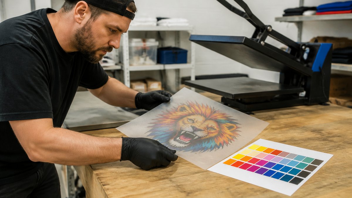
Step-by-step testing to pinpoint the problem
Step 2: Soft-proof the file. Apply your ICC profile in your design software and check how colors should look.
Step 3: Print a nozzle check. Run your printer's nozzle check pattern. Missing lines mean clogged nozzles.
Step 5: Apply to a test garment. Press the transfer onto a dark polyester sample at your normal settings.
This workflow isolates whether the problem is in file preparation, printing, or heat press application. Each step narrows the possibilities.
Building a color reference library for consistency
Keep physical samples of every major color and design you print. Label them with:
- Design name and file
- Print date and batch number
- Printer settings used
- Heat press temperature, time, and pressure
- Garment type and fabric
Over time, this library becomes your quality standard. New team members can compare their work against proven samples. You can also use these to troubleshoot, if a new print doesn't match your reference, you know something changed in your process.
Color shifts in DTF printing are preventable. Most happen because teams skip calibration, use incorrect profiles, or apply wrong heat settings. Preventing color shifts in DTF printing requires systematic attention to file preparation, printer settings, and heat press application. Mirage DTF Transfers provides high-quality direct-to-film transfer solutions for your printing needs.
Frequently Asked Questions
Why do colors shift in DTF printing?
Color shifts occur from multiple sources: RGB-to-CMYK conversion errors, incorrect ICC profiles, heat press temperature inconsistencies, dye migration on polyester, and ink quality issues. The most common cause is mismatched color profiles between your design software and your RIP settings. Test one variable at a time to isolate the source: print a test image with known colors, press it at standard settings, and compare to your original file.
How do DTF color profiles and ICC settings prevent color shifts?
ICC profiles tell your printer exactly how to translate colors from your screen to ink droplets. A proper DTF color profile accounts for your specific printer model, ink set, and film type. Load the correct profile into your RIP software, assign it to your design file before export, and verify your printer firmware recognizes it. Without this, colors shift unpredictably because your printer has no reference for accuracy.
What heat press temperature and time prevent dye migration?
Dye migration, where polyester dyes bleed into your transfer, occurs above 320°F on dark garments. Use 300-310°F for 10-15 seconds on polyester, depending on fabric weight. Test on scrap fabric first: if colors bleed into the garment after washing, lower temperature or reduce press time. Use a calibrated heat press thermometer, not the display, since many show inaccurate readings.
How do I know if my DTF file preparation is causing color shifts?
Print a test file with a color gradient and solid color blocks directly from your design software without any RIP adjustments. If colors look accurate on the transfer, your file prep is correct. If they shift, check your color mode (ensure it's RGB before export), verify your ICC profile is embedded, and confirm white ink coverage isn't overwhelming the base colors. Simplify your design first to rule out complex gradients or transparency issues.